24 Logotypes
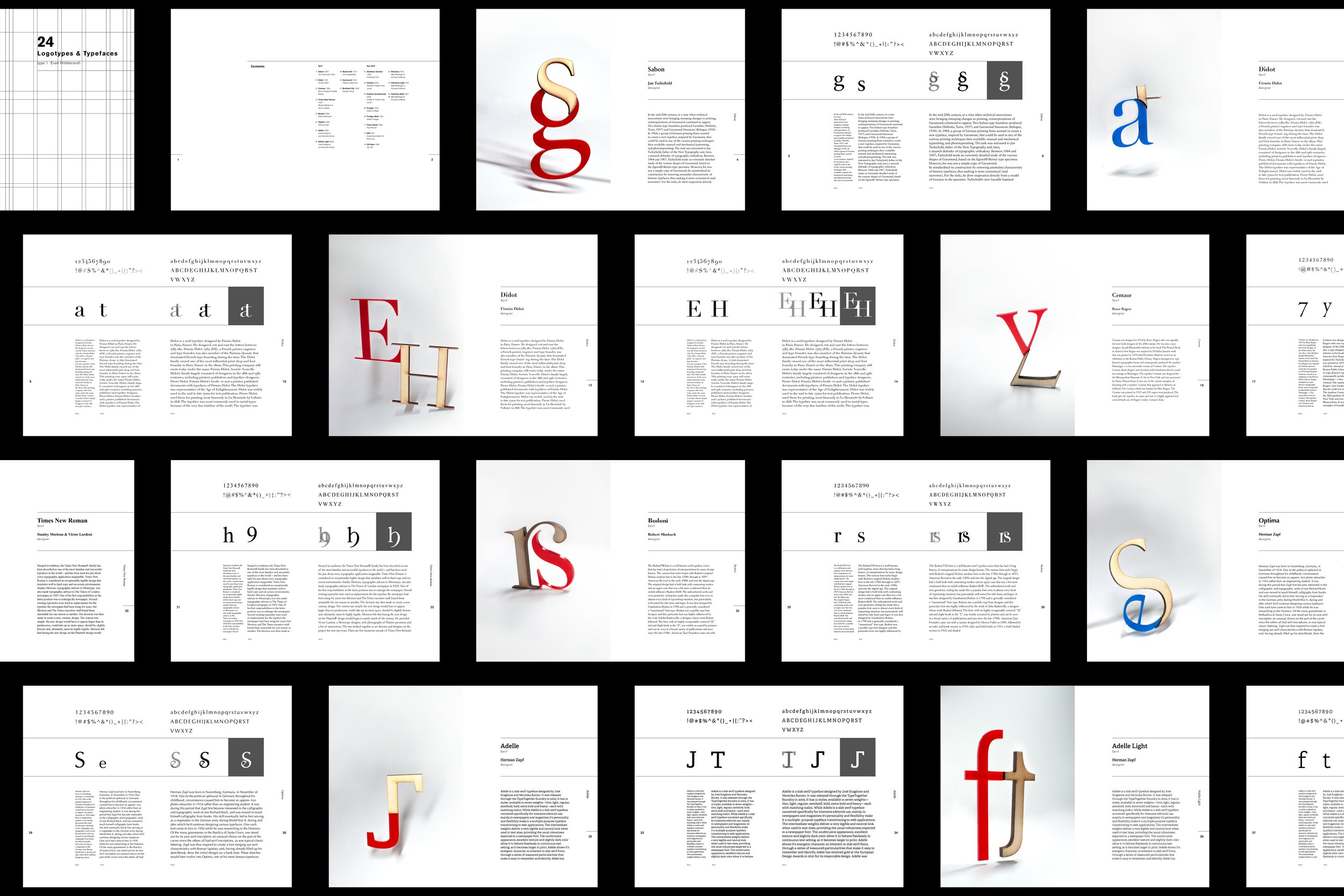
This book came together as part of an assignment in my Typography course at RISD. Students were given the task of creating 24 unique letterforms by combining two pre-existing letters of the same typeface. Half of these would be created with serif typefaces, the others with sans-serif. To maximise creative output, 24 different fonts (or weights) had to be used. After finishing the letterforms, all students were tasked with displaying them via a publication alongside illustrative or photo graphics. In my time at RISD I developed an affinity for laser cutting, and so chose the media of cut wood and coloured acrylic. The differences in colour, texture, and visual weight made them ideal materials to pair together. After cutting the materials to size, I posed and photographed the visual elements to pair with a book layout. The grid system used to layout each page was developed with ease of repetition in mind, with two pages dedicated to each letterform. The final book was 104 pages and printed in hardback for final review.

